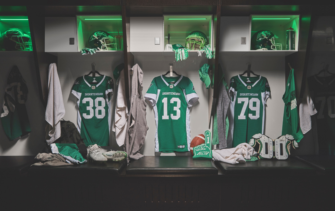
Case Study

Saskatchewan Roughriders

down arrow

Green is the Colour

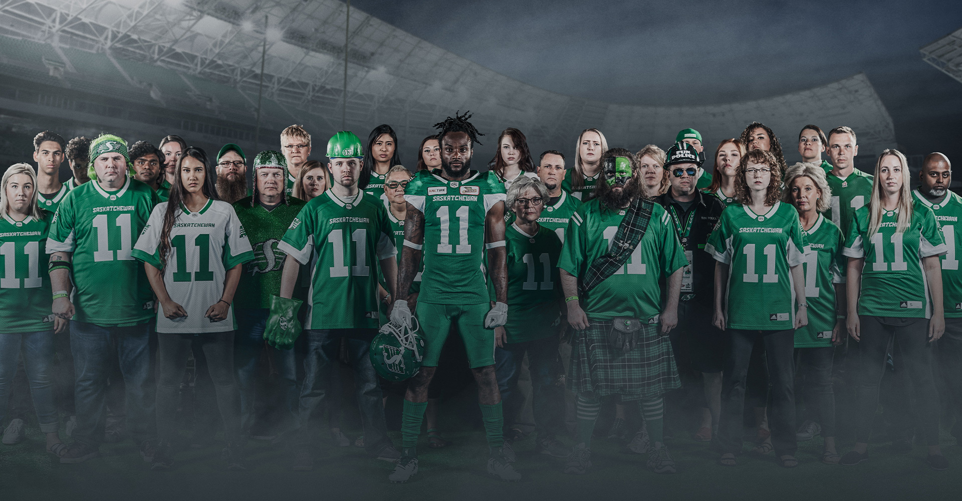
The Saskatchewan Roughrider Football Club is the green and white thread woven into the rich fabric of Saskatchewan. Being a small market team in the Canadian Football League, it has become a metaphor for being the underdog that overcomes adversity and wins—growing to establish itself as one of Canada’s leading professional sports clubs and the third most respected sport brands in Canada. We’ve proudly worked alongside the Riders for over 22 years – helping them evolve and define their brand and creating campaigns to amplify their relationship with their passionate and loyal fanbase, Rider Nation.

What we did:

  • Branding
  • Graphic Design
  • Video Development
  • Media Planning & Buying
  • Copywriting
  • Creative Development

The 13th Man & BEL13VE

The 13th man represents the important player that isn’t on the field, but in the stands – the fans. We’ve incorporated this into wordmarks and logos over the years as a unifying symbol for Rider Nation. And, in true 13th man fashion, it’s been embraced wholeheartedly.

UniteInGreen

To kick off the 2019 season and pack the stands in Mosaic Stadium, we created a campaign that emphasized the importance of the 13th man and how they are a true member of the team that plays a part in every win.

Where Memories Are Made

As hosts for the 2013 Grey Cup, we wanted to make it a memorable year. When we heard "What I Wouldn’t Do" by Serena Ryder, we knew we’d found Rider Nation’s new anthem. It was a proclamation of unwavering commitment and a sure-fire hit. Her beautiful music pushed the emotion in this well-loved ad.